
Chart History of Stock Market
I thought this week I would show some historical perspective of what the Chart History of Stock Market looked like in the 1920's and 1930's and compare that to what the Nasdaq has done since 1990. From 1924, when the Dow was around 100, until the Dow peaked in 1929 around 375 it appreciated near 275% over a 5 1/2 year period before crashing in late 1929 and losing 87% of its value from late 1929 through 1932. Meanwhile the Nasdaq which really started to take off in 1995, when it was near 1000 peaked in early 2000 just above 5100 and appreciated nearly 400% over the 5 year period before selling off severely as well and losing 78% of its value from 2000 through 2002.
To me it's remarkable how similar the two charts look below as revealed by their chart histories. Also notice what happened to the Dow after it finally bottomed in 1932. It was followed by a steady up trend through 1936.
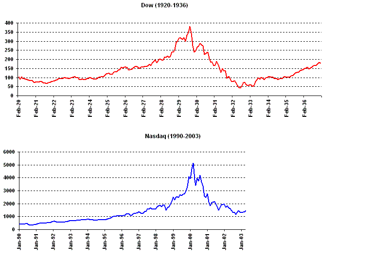
As shown by the table below the chart history of the stock market indicates the Dow suffered horrific losses from 1929-1932 but then had four consecutive up years from 1933-1936. Can the Nasdaq pull off a similar feat from 2003-2006?
| Year | Dow | Year | Nasdaq |
| Return | Return | ||
| 1920 | -32.9% | 1990 | -17.8% |
| 1921 | 12.7% | 1991 | 56.8% |
| 1922 | 21.7% | 1992 | 15.5% |
| 1923 | -3.3% | 1993 | 14.7% |
| 1924 | 26.2% | 1994 | -3.2% |
| 1925 | 30.0% | 1995 | 39.9% |
| 1926 | 0.3% | 1996 | 22.7% |
| 1927 | 28.8% | 1997 | 21.6% |
| 1928 | 48.2% | 1998 | 39.6% |
| 1929 | -17.2% | 1999 | 85.6% |
| 1930 | -33.8% | 2000 | -39.3% |
| 1931 | -52.7% | 2001 | -21.1% |
| 1932 | -23.1% | 2002 | -31.5% |
| 1933 | 66.7% | 2003 | ? |
| 1934 | 4.1% | 2004 | ? |
| 1935 | 38.5% | 2205 | ? |
| 1936 | 24.8% | 2006 | ? |